Take a look at these interesting packaging histories for two of the biggest beer brands in the country. See anything interesting? This isn't a pointless trip down 12-ounce-can history, there's a lesson to be learned.
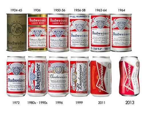
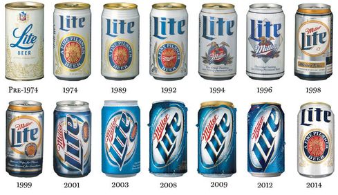
Getting to the lesson means noticing that the biggest graphics changes--the times when, instead of minor tweaks, the brands chose the most dramatic departure from their up-to-that-point look--occurred at a similar point in each brand's history. For Budweiser that was the late 80's; for Miller Lite, the early-90's. That's when these brands started to post significant sales volume declines. Coincidence?
When business gets tough, internal corporate pressure for change can be unrelenting. Distributors wonder what's being done to stem the sales losses. CEOs reactively pressure their underlings for action. Even the trade press can weigh in. None of them have much interest in modest course-correction. "We need dramatic change!" is the battle cry. And it falls on the very receptive ears of brand managers who are always searching for their personal opportunity to "have an impact." So that's why Bud's graphics went horizontal; and Miller Lite went from white to blue. It must've seemed a no-brainer. In a way, it was.
So much for impact
In both cases, the graphics change did virtually nothing to halt the bleeding. No wave of new drinkers clamoring for the new designs rushed in to float the brand's leaky boats. Sure, distributors got a few months of "news" to run in front of their customers, but when beer drinkers didn't embrace the new look, what good was that?
Ironically in view of the lack of business gains, brand managers actually did get one "impact" they valued. The no-brainer: They got to include "managed a major package-graphics change" on their resumes.
The lesson
The important lesson, it seems, is that the more significant the graphics change being considered, the more hesitant management should be in agreeing to it. When a big brand starts posting declines, the odds are label graphics play no role in the decline. So why expect a new label design to reverse fortunes? All the effort that goes into a graphics-change would be better invested in uncovering the brand's true vulnerability. The "easy fix" actually makes finding the real fix less likely.
What's more, changing a brand's look carries with it one certain danger: A new look can unsettle the brand's current loyalists, always the core of its business. People who adopt a brand sporting one look, may be dismayed by a change. Assurances of "New look~Same great taste!" may not hedge this serious risk.
So what's a brewery to do?
Brand-manager presentations in support of any "risk-free updating" of the label design should be greeted with robust skepticism. Easily manipulated internal research purporting to show current users actually prefer the proposed new graphics should be taken with a grain--or a pound--of salt. The "professional opinions" of outside package-design firms--the people with the most to gain from making the biggest-possible change--should pretty much be ignored. Maybe most of all, the marketing people should be called to account for what's really the ailing the franchise.
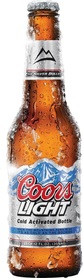 Old | But here we go again Coors Light is right now in the midst of its own several-month sales slump. Years of consistent growth appear to have ended. And, sure enough, here comes the label "update." Decide for yourself whether it's a major change, or a minor tweak. | 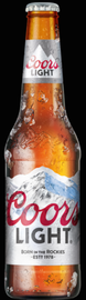 New |
Regardless, our advice to brewery management remains: Be a bit slower to change labels; and maybe a bit quicker to change marketing folks.

 RSS Feed
